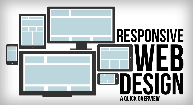
The Internet took off quickly engaging into a crazy growth. Now for the last years, mobile use has experienced the same massive user explosion. Mobile internet usage is soon set to surpass general internet usage and as such companies are preparing for this boom. The growth of mobile usage poses the issue of having responsive websites that would be viewable by all users.
Basis
The basis of the responsive web design or RWD is that page should be viewable on every screen size and device whether mobile or desktop. The website should not only be viewable, it should also be intuitive and offering the same sort of experience on all supports. The RWD is often broken down in three major components, namely the flexible layouts, media queries and flexible media.
Flexible Layouts
In order to build a flexible layout, one needs to start with a flexible grid which would enable the dynamic resizing to any width, depending on the resolution of the screen. These flexible grids use relative lengths units in terms of percentages or em units. Common grid values such as the padding, margin and width would need to be declared using the relative lengths.
Media Queries
Media queries allow developers to specify various style depending on the browser or device. This enables unique styles to be applied for different user experiences. Common media types include the screen, print, tv, all or braille.
Flexible Media
Flexible media is an important aspect of RWD as it allows media to be resized and scaled as per the device and screen view from. An effective way to make media scalable is through the maxwidth property by setting a value of 100%.